The images contained on this page were obtained by
Landsat-5, one of a series of satellites built and launched by the
National Aeronautics and Space Administration (NASA) of the United
States of America. The Landsat satellites observe the Earth, and
the data that they collect have been used for almost 30 years to study
the Earth’s environment, resources, and natural and man-made changes on
the Earth’s surface.
The Landsat series initiated the era of Earth observation from space for non-military purposes. Landsat-type data are now collected by satellite systems built by other countries and commercial enterprises, but Landsat data are the standard for Earth observations, and Landsat is the only system of its type with the mission to collect, archive, and distribute data of all the Earth’s land surface.
The first Landsat was launched on July 23, 1972. This satellite carried on board two instruments to look at the Earth’s surface – a Return Beam Vidicon (RBV) and a Multi-Spectral Scanner System (MSS).
Landsat-1, originally called the Earth Resources Technology Satellite (ERTS-1), was followed by Landsats-2, -3, -4, -5, and -7. Landsat-6 unfortunately failed to reach orbit. Return Beam Vidicons and Multi-Spectral Scanner Systems were flown on the first three Landsats. The MSS proved to be a more useful and reliable instrument that the RBV. Landsats-4 and -5 were equipped with an MSS and an improved version of the MSS, the Thematic Mapper (TM). Landsat-6 carried an “Enhanced Thematic Mapper” (ETM) only, and Landsat-7 is carrying an “Enhanced Thematic Mapper-plus,” or ETM+. The operating dates of the Landsat satellites and the instruments on them are listed on Table 1.
| Launched | Retired | Instruments | |
| Landsat-1 (ERTS-1) | July 23, 1972 | January, 1978 | RBV, MSS |
| Landsat-2 | January 22, 1975 | July, 1983 | RBV, MSS |
| Landsat-3 | March 5, 1978 | September, 1983 | RBV, MSS |
| Landsat-4 | July 16, 1982 | June, 2001* | MSS, TM |
| Landsat-5 | March 1, 1984 | MSS, TM | |
| Landsat-6 | October 5, 1993 | October 5, 1993 | ETM |
| Landsat-7 | April 15, 1999 | ETM+ |
Table 1. Landsat Satellites, their Operational Periods, and Their Instruments.
* The Landsat-4 sensors were not operational after July, 1987; the satellite was later used for maneuver testing.
The data on these CD-ROMs, called the GeoCover data set, cover the United States of America, including Alaska and Hawaii. The data set was produced by the Earth Satellite Corporation for NASA and contains approximately 900 TM images, or scenes. Each Landsat scene is about 115 miles long and 115 miles wide (or 100 nautical miles long and 100 nautical miles wide, or 185 kilometers long and 185 kilometers wide). This data set covers the United States around 1990 and came from observations acquired by theLandsat-5 satellite. Because of satellite scheduling constraints and cloud cover obscuring the ground, the scenes in the GeoCover data set were not all observed (acquired) on the same day or within the same month, but include scenes acquired within a year or two of 1990. Within each image or picture, the smallest picture element, or pixel, covers a square 28.5 meters on a side. No matter how much you zoom in on an image, the smallest square that you can see will be 28.5 meters on a side – even if there are only a few big squares on your screen. That data square is about 94 feet on a side, or an area of about one fifth of an acre or about 0.08 hectare. The TM pixel size enables observation of large natural features, such as volcanos, rivers, and forests, and large man-made features. Major highways, office buildings (such as the Pentagon or US Capitol building), city parks and agricultural fields, airports, major bridges and dams are apparent, but narrow streets, creeks and streams, individual houses, and automobiles cannot be discerned.
Since the data are spread over 4 CD-ROMs, the United States was broken up into smaller areas called tiles or mosaics. Collections of tiles were put on each CD – one CD-ROM covers the eastern United States, another covers the central United States, a third CD-ROM covers the western United States, and one final CD-ROM covers Alaska and Hawaii. Each tile covers an area of 6 degrees of longitude (12 degrees of longitude at latitudes above than 60 degrees, affecting only Alaskan data) by 5 degrees of latitude. A description of the tiling scheme can be found in the GeoCover Product Description Sheet (GeoCover.doc; also Appendix 3.). Technically speaking, these data were orthorectified (geometrically corrected so that they would appear as they would on a map, always looking straight down and not from off to a side). Then the data were projected (displayed) using the Universal Transverse Mercator projection to minimize the distortion caused by taking a piece of a sphere and flattening it.
The TM instrument on Landsat-5 and the ETM+ instrument on Landsat-7 observe the Earth with 7 different filters or “bands”. Bands 1, 2, 3, 4, 5, and 7 on both instruments are sensitive to light energy from the sun reflected by the surface of the Earth. Each band is sensitive to a different part of the reflected solar energy. The parts of the reflected energy are defined by the length of the light waves. Thus, band 1 of the TM and ETM+ instruments records reflected light energy only in the range of 0.45 microns (µm – a micron is one millionth of a meter long) to 0.52 µm. The human eye sees reflected light in that band of wavelengths as the color blue; hence, band 1 is sometimes referred to as the blue band. In a similar manner, bands 2 and 3 of the TM and ETM+ instruments record reflected green and red light, respectively.
TM and ETM+ bands 4, 5, and 7 record reflected light in wavelengths that human eyes cannot detect. These bands are referred to as near infrared (NIR, band 4) and short wave infrared (SWIR, bands 5 and 7).
Band 6 of the TM and ETM+ instruments is different from all the other bands because it does not record reflected light energy, but rather heat energy emitted by the Earth’s surface.
In addition to these bands, the ETM+ instrument also has an eighth band, called the panchromatic sharpening band. ETM+ band 8 is sensitive to reflected light energy across a broad range of wavelengths that includes blue, green, red and near infrared. This panchromatic band has a spatial resolution of 15 meters, rather than the 28.5 or 30 meters of bands 1, 2, 3, 4, 5 and 7. The sensitivities of MSS, TM and ETM+ bands are listed in Table 2.
| Band | RBV | MSS | TM | ETM+ |
| 1 | .48-.57 µm green | .45-.52 µm blue | .45-.52 µm blue | |
| 2 | .58-.68 µm red | .52-.6 µm green | .53-.61 µm green | |
| 3 | .69-.83 µm IR | .63-.69 µm red | .63-.69 µm red | |
| 4 | .5-.6 µm green | .76-.9 µm NIR | .75-.9 µm NIR | |
| 5 | .6-.7 µm red | 1.55-1.75 µm SWIR | 1.55-1.75 µm SWIR | |
| 6 | 0.7-0.8 µm IR | 10.4-12.5 µm TIR | 10.4-12.5 µm TIR | |
| 7 | 0.8-1.1 µm IR | 2.08-2.35 µm SWIR | 2.1-2.35 µm SWIR | |
| 8 | .52-.9 µm panchromatic |
Table 2. Landsat Instrument Bands. IR = infrared; NIR = near infrared; SWIR = short
wavelength infrared; TIR = thermal infrared (long wavelength); and µm = micron or micrometer.
What do the different bands mean to us when we look at the data? To find out what each individual band sees best, or better than the others, check the Landsat-7 images shown in Appendix 2. The individual band images appear as gray scale images – like old-fashioned black-and-white photographs. However, they can be combined to form composite images, with a different gray scale image feeding a different color gun (typically a red-green-blue, or RGB combination). There are many band-color combinations that tell useful stories. Three different and often used composites are summarized below.
______________________________________________________________________________
True Color: For the true color rendition, band 1 is displayed in the blue color, band 2 is displayed in the green color, and band 3 is displayed in the red color. The resulting image is fairly close to realistic – as though you took the picture with your camera and were riding in the satellite. But it is also pretty dull – there is little contrast and features in the image are hard to distinguish.
______________________________________________________________________________
False-Color, also called Near Infrared or NIR: In
this image, band 2 is displayed in blue, band 3 is displayed in green,
and band 4 is displayed in red. This rendition looks rather
strange – vegetation jumps out as a bright red because green vegetation
readily reflects infrared light energy! It is similar to pictures
taken from aircraft when using infrared film and is very useful for
studying vegetation.
___________________________________________________________________________
Short-Wavelength Infrared, or SWIR: In this SWIR image, band 2 is displayed in blue, band 4 is displayed in green, and band 7 (or 5) is displayed in red. This rendition looks like a jazzed up true color rendition – one with more striking colors.
This is the band combination was used in the GeoCover data set. It is built into the GeoCover data and cannot be changed. Further, the contrast and brightness have been altered in the GeoCover data set to make a more consistent overall mosaic.
______________________________________________________________________________
The appearance of different surface features for the different composite images is summarized on Table 4.
| True ColorRed: Band 3 Green: Band 2 Blue: Band 1 |
False ColorRed: Band 4 Green: Band 3 Blue: Band 2 |
SWIR (GeoCover)Red: Band 7 Green: Band 4 Blue: Band 2 |
|
| Trees and bushes | Olive Green | Red | Shades of green |
| Crops | Medium to light green | Pink to red | Shades of green |
| Wetland Vegetation | Dark green to black | Dark red | Shades of green |
| Water | Shades of blue and green | Shades of blue | Black to dark blue |
| Urban areas | White to light blue | Blue to gray | Lavender |
| Bare soil | White to light gray | Blue to gray | Magenta, Lavender, or pale pink |
Table 4. Appearance of Features on Composition Images
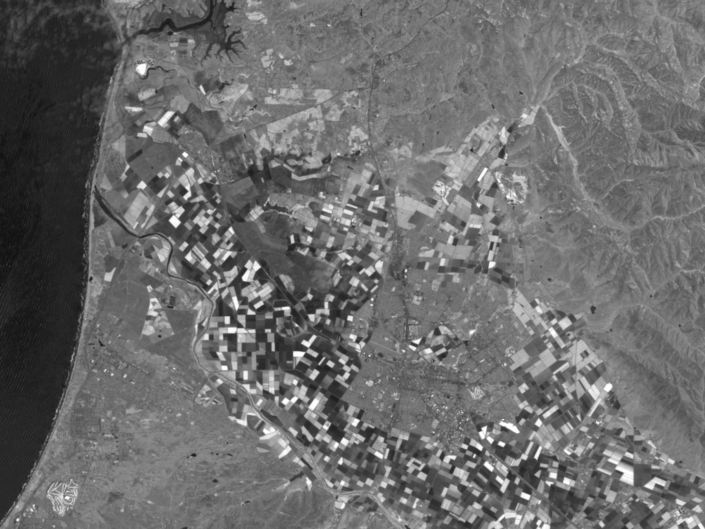
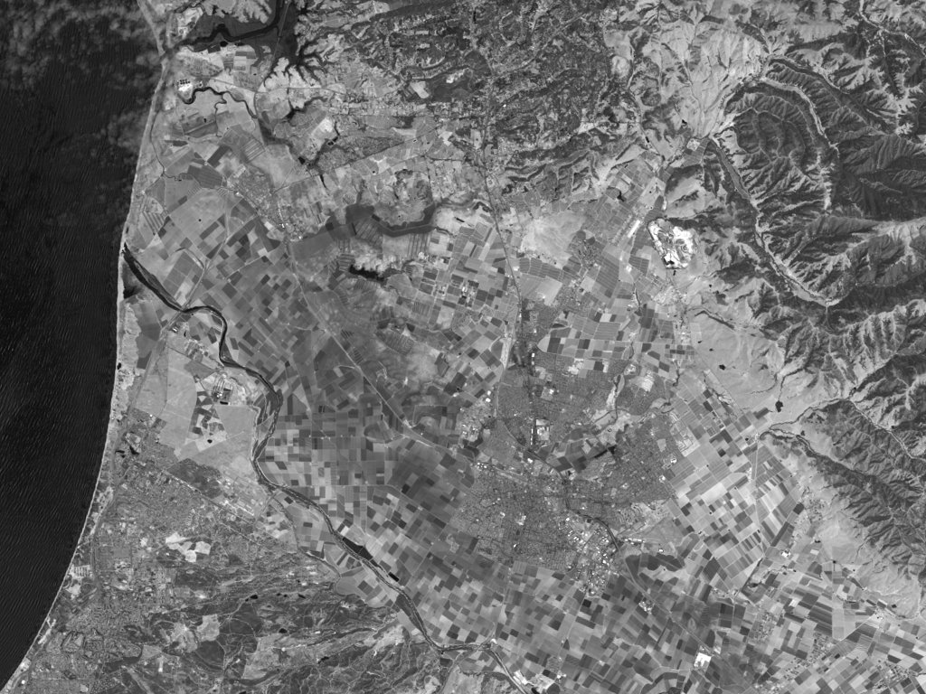
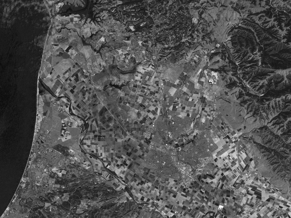
To help understand the value of the different color composites, a set of sample images has been collected for this tutorial. Each sample data set is from the Landsat-7 satellite and includes 3-color composite images created following the recipes above. You can display the images and look at common features in each to see which composite makes finding each feature easier. If you like, you can follow the recipes above and build them yourself (see Appendix 2). The sample data sets are listed in Table 5.
| Area | State | Feature |
| Denver-Northeast | Colorado | City, airports, plains |
| Denver-Northwest | Colorado | City, mountain |
| Fort Morgan | Colorado | Town, irrigated farms, river basin, plains |
| Golden Gate | California | City, bridges, peninsula, island |
| Salinas | California | Town, farmland, valley, rivers, mountains, ocean |
Table 5. Landsat-7 Data Sets
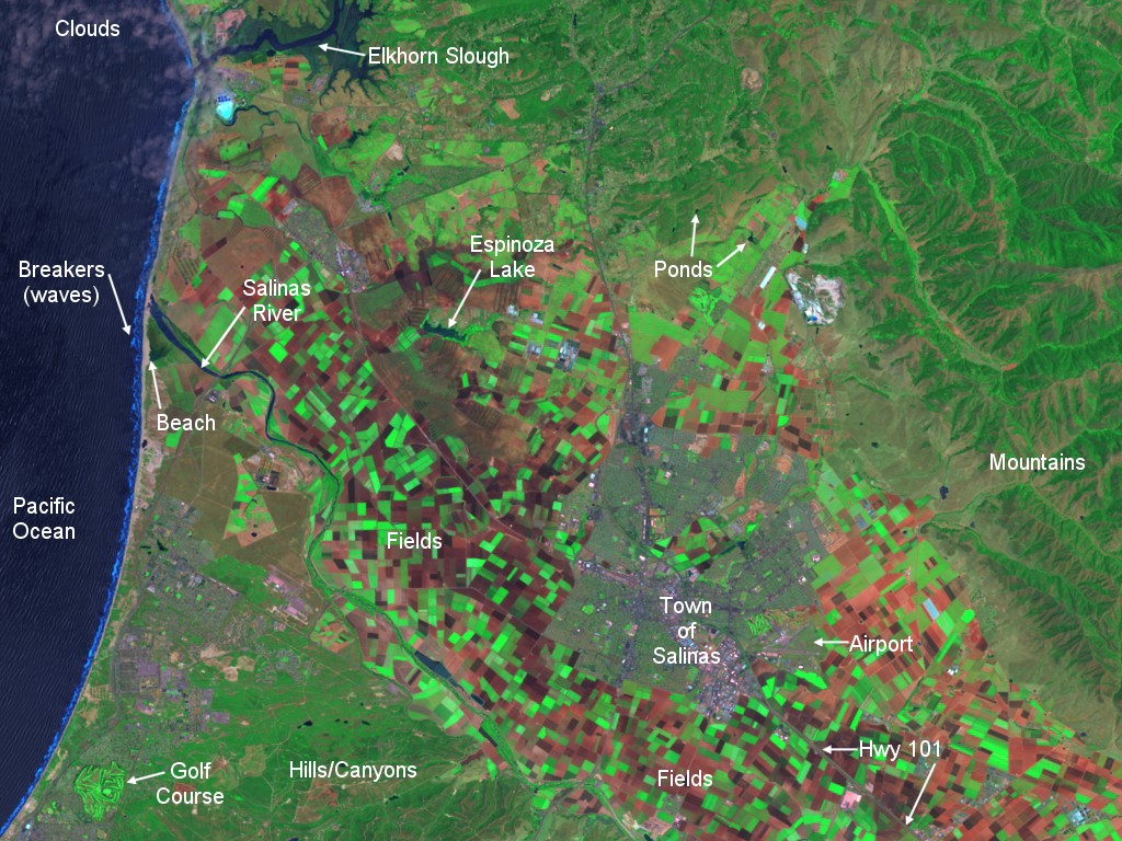
The Salinas, California data set includes an additional image labeled “SaCA-T.tif” which has some features annotated on it. The annotations will help you start identifying features in the images. You have to study the shape and size of things as well as their color and their relationship to other features around them. For instance, both fields and tree covered neighborhoods in a town or city may be rectangular in shape. But the city blocks are usually a different color, they are much smaller than agricultural fields, and they typically are in a systematic grid. Fields tend to follow the terrain and form polygons more often than city blocks. But remember, sometimes you can be fooled. The only real truth is what is called ground truth – when you go to a place and see what is actually there!
Note that the Landsat-7 data sets are from 1999, not 1990. There will be some noticeable changes that have occurred in the time in between them. Take a look at the Landsat-7 ****-742.tif images and the corresponding locations in the GeoCover data set. Can you determine what changes were natural and what changes were manmade? For a starter, look at the Denver-Northeast data set in 1999 (the Landsat-7 sample data set) and find the same area in the 1990 era GeoCover data set. Denver is located in tile N-13-35, near the top, in the center (around longitude 105 degrees West and latitude 39.7 degrees North, or Easting 500000 meters and Northing 4394461 meters). You can find it by looking for a splash of purple to the right of the dark green mountains (some of which have snow on them). Then zoom in on Denver and look around.
Now that you have some understanding of these images, where should you go exploring? Try some places you know – like your home town. If there are prominent features – geological (mountains, deserts, lakes, rivers, volcanoes, etc.) or man-made (major highways, big bridges, golf courses, cities or towns, airports, etc.) that you know, look for them in the GeoCover data set.
If you are unfamiliar with an area, a map can be helpful. Maps are representations of a geographic area and may emphasize different features, sometimes at the cost of omitting others. For example, a map showing political boundaries may not show the terrain and its elevations or the vegetative cover of the area – and vice-versa. Also, the geography may have changed since the map was made or the satellite images were taken. Cities grow, and monitoring urban growth worldwide is one of the uses of the Landsat satellites. The same holds true for deforestation – the clearing of forests. Landsat does an excellent job of observing forest changes (see the web sites for examples). Nonetheless, maps can be powerful tools to help you understand what you are seeing from space. Some simple maps are included with the sample data sets. You might want to look up the sample areas in a road atlas and see the how the atlas compares with the Landsat image.
When you are comfortable with your understanding of what you are viewing, go to places you have heard about or would like to visit. And don’t forget to bring along a map. Maps can help you to locate where you want to go – start by looking for the big features like cities, lakes, and major rivers. Once you locate yourself in the big picture, zoom in (magnify) your area of interest. If you zoom in too soon, you will have a difficult time finding what you are looking for.
Finally, why be concerned with Landsat data? What can they tell us? Where can we use them productively? The following list of applications for Landsat data dates from 1982 (the era of Landsats-2 and -3) and is still valid.
Agriculture, Forestry, and Range Resources:Discrimination of vegetative types: Crop types, Timber types, Range vegetation.
Measurement of crop acreage by species (estimating crop yields)
Measurement of timber acreage and volume by species (monitoring forest harvest)
Determination of range readiness and biomass
Determination of vegetation vigor
Determination of vegetation stress
Determination of soil conditions
Determination of soil association
Assessment of grass and forest fire damage
Land Use and Mapping:
Classification of land uses
Cartographic mapping and map updating
Categorization of land capability
Separation of urban and rural categories (monitoring urban growth)
Regional planning
Mapping of transportation networks
Mapping of land-water boundaries
Mapping of fractures
Geology:
Recognition of rock types
Mapping of major geologic units
Revising geologic maps
Delineation of unconsolidated rock and soils
Mapping igneous intrusions
Mapping recent volcanic surface deposits
Mapping landforms
Search for surface guides to mineralization
Determination of regional structures
Mapping linears
Water Resources:
Determination of water boundaries and surface water area and volume
Mapping of floods and flood plains
Determination of areal extent of snow and snow boundaries (estimating snow melt runoff)
Measurement of glacial features
Measurement of sediment and turbidity patterns
Determination of water depth
Determination of irrigated fields
Inventory of lakes
Oceanography and Marine Resources:
Detection of living marine organisms
Determination of turbidity patterns and circulation
Mapping shoreline changes (tracing beach erosion)
Mapping of shoals and shallow areas
Mapping of ice for shipping
Study of eddies and waves
Environment:
Monitoring surface mining and reclamation
Mapping and monitoring of water pollution (e.g., tracing oil spills and pollutants)
Detection of air pollution and its effects
Determination of effects of natural disasters
Monitoring environmental effects of man’s activities (e.g., lake eutrophication, defoliation, etc.)
Feel free to explore these topics and see what has been done with Landsat data. A very good source of information about Landsat and its uses is the Landsat internet site at NASA’s Goddard Space Flight Center, at
http://landsat.gsfc.nasa.gov/.
This site also has links to other tutorials related to using Landsat data.
If you want to see current Landsat data, go to the United States Geological Survey (USGS) Landsat-7 internet site at
http://landsat7.usgs.gov.
The USGS browse images are free on the web and can be downloaded by going to the above USGS Landsat-7 web site, clicking on “search archives”, and then on “Visit EarthExplorer.” These browse images are in JPG format and typically are around 125 kilobytes in size. They do not have the full Landsat resolution, however, as each pixel represents about 240 meters, not 30. Otherwise the files would be around 55 megabytes in size, not 125 kilobytes! By the way, EarthExplorer also allows you to obtain browse images of earlier Landsat data.
Acknowledgements
This tutorial was written by Charles Wende of NASA Headquarters with help and advice from numerous members of the Landsat community, in particular Ed Sheffner of NASA Headquarters; Darrel Williams, Jim Irons, and Laura Rocchio of the NASA Goddard Space Flight Center; and Jon Dykstra of the Earth Satellite Corporation. The UTM grid in Appendix 3 (Figure App-3-3) is courtesy of Peter H. Dana, The Geographer’s Craft Project, Department of Geography, University of Colorado at Boulder.
APPENDIX 1: Using Viewers
A PC/Windows viewer is included with the GeoCover data set. It has the feature of displaying the location of the cursor in units of degrees of latitude and longitude. Most of the viewers available on the internet only locate the cursor in the zone, X (easting) and Y (northing) of the Universal Transverse Mercator (UTM) coordinate system (See Appendix 3).
There are several free PC/Windows viewers available from the internet. They are listed below. They will all read GeoCover data in the MrSid format. Most will also read data in the GeoTIFF format used in the sample data sets.
| Name | URL | Comment |
| MrSid | www.lizardtech.com | Allows saving a section of the overall image as a TIFF file |
| GeoViewer | www.lizardtech.com | Allows saving a section of the overall image as a TIFF file |
| Freeview | www.pcigeomatics.com | Allows changing brightness, contrast, equalization of image |
| ArcExplorer | www.esri.com | Scale bar available at bottom, add layers |
| MapSheets Express | www.erdas.com | Allows changing brightness, contrast, add layers |
| Viewfinder | www.erdas.com | 3 panels; adjust brightness, contrast, sharpen, etc. |
| dlgv32pro |
mcmcweb.er.usgs.gov/drc/dlgv32pro/ |
Allows overlays, grids as lat-long or UTM or none |
For the Macintosh, only a version of the MrSid viewer is available (URL: www.lizardtech.com). See the “Viewers” folder on Disk 1.
Similarly, for Linux, IRIS, and Sun Solaris 2.6users, a MrSid viewer is also available (URL: www.lizardtech.com). See the “Viewers” folder on Disk 1.
The instructions below should help you start exploring the GeoCover data set:
1. Start the viewer (MrSID, MrSIDGeoViewer, Freeview,…)
2. Expand to full screen, if possible
(click on the box in the upper right corner of the screen, between the “_” and the “X”).
3. Insert the CD-ROM you want to use into your CD-ROM drive.
4. Open the MrSID file of your choice following standard windows file opening procedures:
a. Click on “File”, then “Open” – you will get the standard open file window.
b. Click on the downward facing triangle and click on the drive that is your CD-ROM.
c. Click on the only folder/directory (e.g., “WestUS”)
d. Click on the folder/directory named for the tile wanted:
- for Salinas, CA, use “N-10-35″
for Golden Gate, CA use “N-10-35″
for Denver, CO use “N-13-35″
for Fort Morgan, CO use “N-13-35″
e. Click on the .SID file named for the tile, e.g. “N-10-35_loc.sid” or “N-13-35_loc.sid”.
f. Click on “Open”, or double click the above.
5. You will see a small rendition of the overall image.
6. To enlarge the image, or to focus on a specific area:
In MrSID viewer or MrSID GeoViewer, eithera. First, click on the magnifying glass with the “+”, on the toolbar, then
b. Move the cursor to the area you want to magnify, and
c. Click once for each 2x magnification you want
– this step will both center the image and magnify it,
or
d. Center the image on the area you want using the above step, and then
e. Grab the slider on the right-hand side of the screen (it is at the top of the slide) and pull it down
- you will see the image change and then resolve itself at higher resolution.
In Freeview,
a. First, click on the area you want to enlarge. An “X” or “+” will appear at that spot on the image.
b. Then, click on the magnifying glass with the “+” on the top toolbar,
once for each time you want to enlarge the image.
Note that you may click on the magnifying glass with the numeral “1″ (a one, not the letter L) on the top toolbar and get the maximum (one data pixel = one image pixel) magnification immediately.
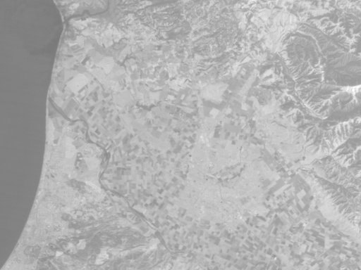
APPENDIX 2: Gray-scale images for bands 1-7 of Salinas, CA.The following set of sample images are for the Salinas, California area south of San Francisco. It includes a sample from each individual band, although only one of the two band 6 images is presented. When comparing images, pick a few specific features to compare, such as:
The ocean (Light, dark, textured, smooth?)The breakers along the beach (Visible or invisible?)
Various fields (Do they stay the same shade of gray?)
The lakes/ponds and rivers (Are they clear and distinct, or are they hard to find?)
The airport (Do the runways stand out or do they fade away?)
The major highways (Are they sharper in some bands than others?)
The town of Salinas (Is it lighter or darker than the surrounding area? By a lot or a little?)
Then look for the same feature or features in the images from two or more different bands.
______________________________________________________________________________
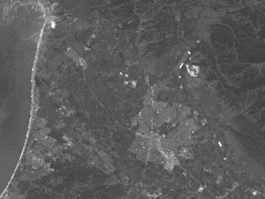
Band 1: Blue light (0.4-0.5 microns) is scattered by
the atmosphere and illuminates material in shadows better than longer
wavelengths (remember, blue is the short-wavelength end of the
spectrum). Blue penetrates clear water better than other colors –
see the texture of/in the water along the shore. It is absorbed
by chlorophyll, and so plants don’t show up very brightly in this
band. That is why the fields all look drab and washed out.
However, it is useful for soil/vegetation discrimination, forest type
mapping, and identifying man-made features, such as the airport in the
lower right area of the image.
______________________________________________________________________________
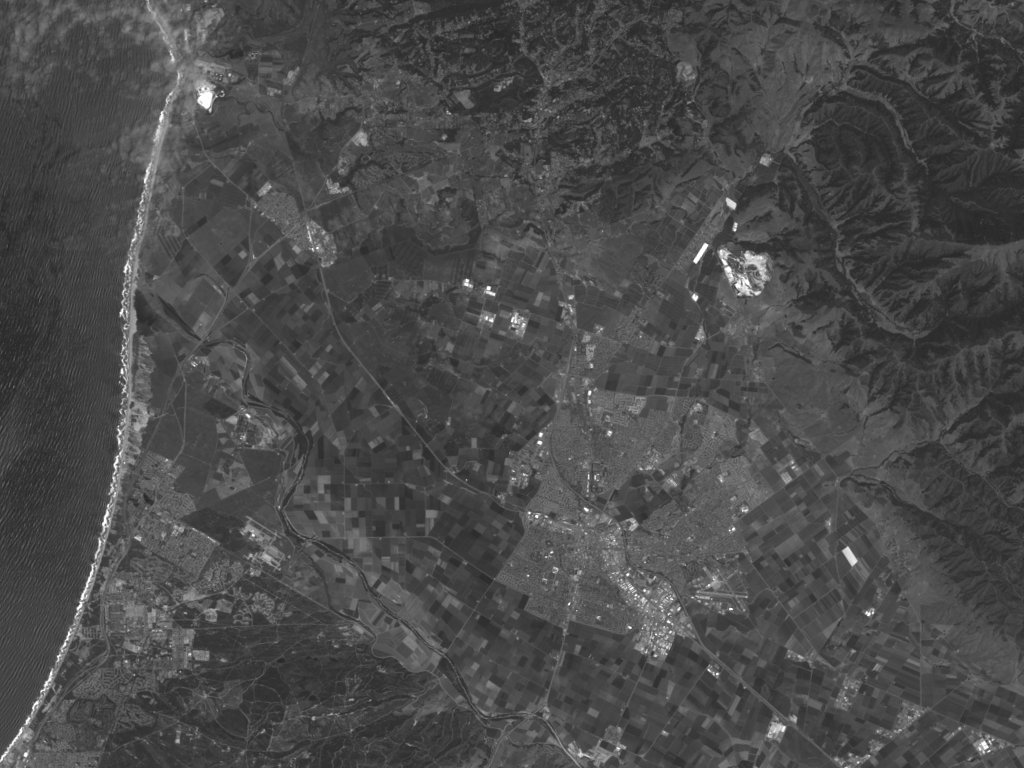
Band 2: Green light (0.5-0.6 microns) penetrates clear
water fairly well, and gives excellent contrast between clear and
turbid (muddy) water. It helps find oil on the surface of water,
and vegetation (plant life) reflects more green light than any other
visible color. Manmade features are still visible (note the
airport).
______________________________________________________________________________
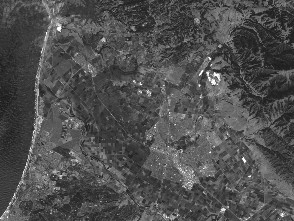
Band 3: Red light (0.6 – 0.7 um) has limited water
penetration. It reflects well from dead foliage, but not well
from live foliage with chlorophyll. It is useful for identifying
vegetation types, soils, and urban (city and town) features.
______________________________________________________________________________
Band 4: Near IR (NIR, .7-1.2 microns, redder than red,
but not visible) is good for mapping shorelines and biomass
content. It is very good at detecting and analyzing
vegetation. See how the fields that looked almost the same in
bands 1, 2, or even 3 have changed dramatically in band 4. But
the airport has darkened.
______________________________________________________________________________
Band 5: The short wavelength infrared (SWIR, 1.55 –
1.75 microns, even redder than NIR) has limited cloud penetration and
provides good contrast between different types of vegetation. It
is also useful to measure the moisture content of soil and vegetation.
It helps differentiate between snow and clouds.
______________________________________________________________________________
Band 6: Thermal infrared (TIR, 5.0 – 14.0 microns, so red it “sees” warm objects; also called long-wavelength infrared (LWIR) or thermal IR) is useful to observe temperature and its effects, such as daily and seasonal variations. It is also useful to identify some vegetation density, moisture, and cover type. This image has only 60-meter pixels, so it is not as sharp as the other images. Band 6 pixels on Landsat-5 are 120 meters.
______________________________________________________________________________
Band 7: Another short wavelength infrared (SWIR, 2.08
– 2.35 microns, although somewhat longer wavelength than Band 5) has
limited cloud penetration and provides good contrast between different
types of vegetation (compare to vegetation in bands 4 and 5). It
is also useful to measure the moisture content of soil and vegetation.
It helps differentiate between snow and clouds.
______________________________________________________________________________
The sample data sets included with this tutorial contain a number of Landsat-7 scenes. The differences between Landsat-5 and Landsat-7 are:
1. Landsat-7 has a 60-meter resolution thermal band (band 6), while Landsat-5 had a 120 meter thermal band; and
2. Landsat-7 has a additional 15-meter resolution panchromatic (wide-spectrum) band which allows users to sharpen the 28.5-meter bands.
These data appear as a set of grayscale images. Since band 6 has only 60 meter spatial resolution, the image is half the height and half the width of the images for bands 1, 2, 3, 4, 5 and 7. Band 8 has 15 meter resolution and a broad spectral response. It is used to “sharpen” the 30 meter images. Since it has 15 rather than 30 meter resolution, its image is twice the height and twice the width of the images from bands 1, 2, 3, 4, 5, and 7.
As you look at the individual band images for the sample data of the Salinas, California area (see above), you will observe that different features appear in the images from different bands. If you have image processing software that handles TIFF (or TIF) files on your computer, try loading the sample images into your computer and then experimenting with changing the brightness, and/or contrast, or other characteristics of individual band-images and see what you can bring out. Sometimes the results are surprising! Available image processing software includes (there are others):
Adobe Photoshop (commercial software)
Jasc Software’s Paint Shop Pro (shareware, 30-day free trial from the internet at www.jasc.com)
Geomatica’s Freeview (freeware available from the internet at www.pcigeomatics.com), and
Viewfinder (freeware available from the internet at www.erdas.com)
Compositing: Next, try combining three single-band, gray scale images into a single color image. By choosing different band combinations, different land features are emphasized. If your computer software allows you to separate a color image into “red”, “green”, and “blue” black-and-white images and to recombine them into a color image, you can put together a synthetic color image, or composite image. First, go to the recombining step. Identify the “red” gray scale image (by file name) as band 3; identify the “green” gray scale image (by file name) as band 2; and identify the “blue” gray scale image (by file name) as band 1. Push the recombine button (or whatever your computer tells you to do) and you’ll see a color image!
Table App-2-1 summarizes what different features look like in different bands, in particular which individual band or bands are best used to look for a particular feature. It also tells what color the feature will appear to be in a false-color composite (not the GeoCover composite).
| Feature | BestBand | Gray-scale (black and white) | False Color, or NIR |
| Clear Water | 4 | Black tone | Black |
| Silty Water | 2, 4 | Dark in 4 | Bluish |
| Nonforested Coastal Wetlands | 4 | Dark gray tone between black water and light gray land | Blocky pinks, reds, blues, blacks |
| Deciduous Forests | 3, 4 | Very dark tone in 3, light in 4 | Dark red |
| Coniferous Forest | 3, 4 | Mottled medium to dark gray in 4; Very dark in 3 | Brownish-red and subdued tone |
| Defoliated Forest | 3, 4 | Lighter tone in 3, darker in 4 | Grayish to brownish-red, relative to normal vegetation |
| Mixed Forest | 2, 4 | Combination of blotchy gray tones | Mottled pinks, reds, and brownish-red |
| Grasslands (in growth) | 3, 4 | Light tone | Pinkish-red |
| Croplands and Pasture | 3, 4 | Medium gray in 3, light in 4 | Pinkish to moderate red, depending on growth stage |
| Moist Ground | 4 | Irregular darker gray tones (broad) | Darker colors |
| Soils – Bare Rock – Fallow Fields | 2, 3, 4 | Depends on surface composition and extent of vegetative cover. If barren or exposed, may be brighter in 2 and 3 than 4 | Red soils and red rock in shades of yellow; gray soils and rock dark bluish; rock outcrops associated with large land forms and structure. |
| Faults and Fractures | 3, 4 | Linear (straight or curved), often discontinuous; interrupts topography; sometimes vegetated | |
| Sand and Beaches | 2, 3 | Bright in all bands | White, bluish, light buff |
| Stripped Land-Pits and Quarries | 2, 3 | Similar to beaches – usually not near large water bodies; often mottled, depending upon reclamation | |
| Urban Areas: Commercial | 3, 4 | Usually light tones in 3, dark in 4 | Mottled bluish-gray with whitish and reddish specks |
| Urban Areas: Residential | 3, 4 | Mottled gray, street patterns visible | Pinkish to reddish |
| Transportation | 3, 4 | Linear patterns; dirt and concrete roads light in 3, asphalt dark in 4. |
Table App-2-1: Appearance of Surface Features in Individual Bands and NIR Composite Images.
Sharpening: Landsat-7’s band 8 is used to sharpen the images from bands 1, 2, 3, 4, 5, and 7. Sharpening enhances a lower resolution composite image by impressing a higher resolution panchromaic image upon it. You can follow the recipe below to try it yourself.
Begin by making a three-band RGB composite, such as the 7-4-2 combination used in the GeoCover data set. How to do that is described above. If you have difficulty building a composite image, there are composite images included in each set of sample data.
Next, double the composite image size – from 1024 x 768 pixels to 2048 x 1536 pixels – using your software’s resizing function. Now the enlarged composite image and the band 8 image should be the same size.
Then, separate the enlarged RGB composite using the hue-saturation-luminance (HSL) scheme, sometimes called the hue-saturation-intensity (HSI) scheme. Your software should tell you the names of the three new files – one associated with hue, another with saturation, and the third with luminance or intensity.
Replace the luminance (intensity) file with the band-8 file (erase the luminance file, make a copy of the band-8 file, and rename the copy).
Then, reconstruct the image from the hue-saturation-(new) luminance files, and you should have a sharpened image. In effect, the resulting image combines the spatial resolution of the 15 meter pan band with the color characteristics of the 30 meter data. There are examples given in the sample data sets (they have the ***-S.tif file name).
You may be wondering what is the difference between the RGB color scheme and the HSL color scheme. They represent different ways of describing what we call “color.”
RGB (Red-Green-Blue) is the same scheme that is used in a color television set. Red, green, and blue colors, with various intensities, are added together to produce the final color that you see. If the red, green, and blue guns are all turned off (intensity 0), then the color is black. Similarly, if they are all at their maximum, the resulting color is white. Various gun intensity combinations give the colors in between.
HSL (Hue-Saturation-Luminance) is a alternative color discription. Hue is determined by the dominant wavelength that you see – red-orange-yellow-green-blue-violet, etc. Saturation specifies the purity of the color relative to a gray scale. Pastel colors such as pink are near the white end of the saturation scale and have low saturation. Vivid colors (e.g., crimson) are usually in the mid-range, and extremely saturated colors are nearly black (e.g., a very dark Burgundy red). Luminence refers to the total brightness, or intensity, of a color (like comparing a 5 watt light bulb to a 50 watt bulb to a 150 watt bulb, all through a filter giving the same hue and saturation).
By maintaining the hue and saturation of the 30 meter image (already colorized, so to speak, by adding together three black and white images fed through RGB filters) the color characteristics of the 30 meter composite image are carried forward. By replacing the luminence (intensity) with the 15 meter black and white image, the spatial character of the 15 meter image is imposed on the color character of the 30 meter image and a sharpened image results. For more information on sharpening, see pages 525 to 532 in the Lillesand and Keiffer book in the references.
APPENDIX 3: Coordinate Systems.
Most of us are familiar with the latitude-longitude system of defining coordinates on the Earth. Latitude runs north and south from the equator, with the equator at 0 degrees latitude, the north pole at 90 degrees north latitude, and the south pole at 90 degrees south latitude (sometimes given as -90 degrees). Longitude runs east and west from an arbitrary starting point running through Greenwich, England. The western hemisphere, which contains most of the United States, lies to the west of Greenwich England. Longitudes in the western hemisphere must be either demarcated with a negative sign (i.e., as negative degrees of longitude) or explicitly stated as “west longitude” or “degrees west.” It is also possible to give a longitude based on 360 degrees (e.g., Washington, DC’s longitude would be 283 degrees rather than 77 degrees west, or -77 degrees). The approximate locations of some cities in the United States are given in table App-3-1.
| City | Lat. (deg.) |
Long. (deg.) |
Zone |
Easting
(meters) |
Northing
(meters) |
| Bangor, ME |
44.8 N
|
68.7 W
|
19
|
523727
|
496777
|
| Boston, MA |
42.3 N
|
71.2 W
|
19
|
318655
|
4685430
|
| New York, NY |
40.75 N
|
74 W
|
18
|
584419
|
4491505
|
| Philadelphia, PA |
40 N
|
75.2 W
|
18
|
482928
|
4427776
|
| Washington, DC |
38.9 N
|
77 W
|
18
|
326565
|
4307580
|
| Miami, FL |
25.8 N
|
80.2 W
|
17
|
580198
|
2853779
|
| Chicago, IL |
41.8 N
|
87.7 W
|
16
|
441846
|
4627808
|
| Atlanta, GA |
33.8 N
|
84.3 W
|
16
|
749958
|
3743258
|
| New Orleans, LA |
30 N
|
90 W
|
16
|
210590
|
3322576
|
| Minneapolis, MN |
45 N
|
93.3 W
|
15
|
476355
|
4982991
|
| Omaha, NB |
41.2 N
|
95.9 W
|
15
|
256830
|
4565015
|
| St. Louis, MO |
38.7 N
|
90.3 W
|
15
|
734501
|
4286947
|
| Dallas, TX |
32.8 N
|
96.8 W
|
14
|
705998
|
3631258
|
| Fort Morgan, CO |
40.3 N
|
104 W
|
13
|
590940
|
4463460
|
| Denver, CO |
39.7 N
|
105 W
|
13
|
500000
|
4394461
|
| Albequerque, NM |
34.5 N
|
106.3 W
|
13
|
380652
|
3818365
|
| Salt Lake City, UT |
40.8 N
|
111.8 W
|
12
|
432516
|
3629133
|
| Los Angeles, CA |
34 N
|
118.2 W
|
11
|
389180
|
3629133
|
| San Diego, CA |
32.8 N
|
117.2 W
|
11
|
481275
|
3629133
|
| Seattle, WA |
47.6 N
|
122.3 W
|
10
|
552619
|
5272081
|
| Salinas, CA |
36.7 N
|
121.7 W
|
10
|
618060
|
4064520
|
| San Francisco, CA |
37.7 N
|
122.4 W
|
10
|
552893
|
4172700
|
| Juneau, AK |
58.4 N
|
134.4 W
|
8
|
535069
|
6473401
|
| Fairbanks, AK |
64.8 N
|
147.7 W
|
6
|
466744
|
7186349
|
| Anchorage, AK |
61.3 N
|
149.8 W
|
6
|
350022
|
6799419
|
| Honolulu, HA |
21.5 N
|
158 W
|
4
|
603583
|
2377817
|
Table App-3-1. Approximate Locations of Some Major United States Cities.
This table gives the locations in two coordinate systems: the latitude-longitude system most of us know, and the Universal Transverse Mercator (UTM) system used by the GeoCover data set. The conversion software used to generate the table gives coordinates in meters – while cities themselves encompass many square miles. Therefore the last three digits, and sometimes four digits, in the rightmost columns of the table are not very useful, if not meaningless. Unfortunately, most of the viewers can only display the coordinates in UTM.
The Universal Transverse Mercator coordinate system is apparently not exactly universal – there are variations. Per the original definition, the Earth was divided into zones 6 degrees wide along the equator, starting at 180 deg. of longitude and working Eastward. The center of zone 1 is at -177 deg., or 177 deg. W (zone 1 covers from 180 deg. W to 174 deg. W). The center of zone 2 is at 171 deg. W (zone 2 covers from 174 deg. W to 168 deg. W); etc. These zones originally ran from 80 deg. South latitude to 84 degrees North latitude. At higher latitudes UTM was not used.
The variation used in the Geocover data set uses the same zone definition along the equator (i.e., the zones are 6 degrees of longitude wide at the equator), but these zones only run from 60 deg. S to 60 deg. N. Above 60 deg. N and below 60 deg. S, the zones are widened to 12 degrees of longitude. Further, to insure overlap with neighboring zones, each tile (mosaic) extends at least an extra 50 kilometers east and west, and at least 1 kilometer extra north and south.
The tiles or mosaics in the original definition are 8 degrees of latitude high. In the GeoCover data set, each tile is 5 degrees of latitude high.
The GeoCover tiles (mosaics) follow the 3-element naming convention given below:
The first element is the hemisphere: N (northern) or S (southern);
The second element is the UTM zone number: 1 to 60; and
The third element is latitude of the equator-most edge of the tile:
In the northern hemisphere, the latitude (degrees) of the southern edge of the tile, and
In the southern hemisphere, the latitude (degrees) of the northern edge of the tile.
For example:
“N-13-25_loc” names a mosaic/tile in the northern hemisphere, in UTM zone 13, extending between 25 and 30 degrees north latitude.
“S-21-10_loc” names a mosaic/tile in the southern hemisphere, in UTM zone 21, extending between 10 and 15 degrees south latitude.
What the above boils down to is: the tiles (individual pieces of the overall mosaic) are 6 degrees of longitude wide, as measured at the equator, and 5 degrees of latitude tall – until you get above 60 degrees of latitude north or below 60 degrees of latitude south. Then the tiles are 12 degrees of longitude wide, but still 5 degrees of latitude tall.
The identification scheme used at higher latitudes is to identify a tile by its westernmost zone number. That is, at high latitudes the odd-numbered zones are usually combined with the even-numbered tile to the west. For example, the tile covering the Alaskan Arctic from 162 deg. W to 150 deg. W (zones 4 and 5 at lower latitudes) and 70 deg. N to 75 deg. N would be labelled N-04-70_loc. The next two Easternmost high-latitude tiles would be N-06-70_loc and N-08-70_loc (the area covered by N-05-70 was included in N-04-70, and the area covered by N-07-70_loc was included in N-06-70_loc).
Two tiles in the same zone and neighboring latitudes may combined if the resulting data set is still reasonably sized. For example, Hawaii is in a tile labeled N-04-15-20, indicating it is zone 4, with pieces from latitudes 15-20 deg. N. and 20-25 deg. N. Occasionally, a boundary of a tile may be extended to include a small land mass in a neighboring tile. For example, tile N-18-35 (Delaware, Maryland, Virginia, and most of North Carolina) includes a small northern piece of what would technically be tile N-18-30 (the southeast portion of North Carolina).
The coordinates themselves are displayed in terms of “Eastings” (X, or horizontal distance) and “Northings” (Y, or vertical distance) away from a reference position. These Eastings and Northings are usually given in meters, although some viewers allow you to change these units to kilometers or miles. However, these Eastings and Northings may not be zero at the westernmost edge (Eastings) or the equator (Northings). Sometimes “false easting” and “false northings” are used so that all X’s increase as you go eastward, and all Y’s increase as you go northward, and both X’s and Y’s may be adjusted to be positive numbers. These units are as defined as follows:
Northern Hemisphere:
The False Eastings (X) are referenced by setting the central meridian (the line going up and down the center of each zone, even at high latitudes where a “zone” may include the longitude span of two low latitude zones) to 500,000 meters (or 500 kilometers) and increasing as you move eastward. That means that whenever you are exactly in the east-west center of a zone, x is 500,000 meters. West of the central meridian, X is less than 500,000 meters; east of the central meridian, X is larger than 500,000 meters.The Northings (Y) are referenced to the equator being set to 0 (zero) meters and increasing northward.
Southern Hemisphere:
The False Eastings (X) are referenced by setting the central meridian (the line going up and down the center of each zone) to 500,000 meters (or 500 kilometers) and increasing as you move eastward. It is the same scheme used in the northern hemisphere.The Northings (Y) are sometimes referenced to setting the equator to a value of 0 meters, but in this case Y becomes more negative the further south you go. Another approach uses False Northings (Y’) which are referenced by setting the equator to 10,000,000 meters (or 10,000 kilometers) and still increasing northward. That means that all False Northings in the Southern Hemisphere are between 0 meters and 10,000,000 meters (10,000 kilometers). When False Northings are used, the southern hemisphere is sometimes identified by assigning it a negative zone number.
An illustration of a part of Zone 18 in the northern hemisphere is given below:
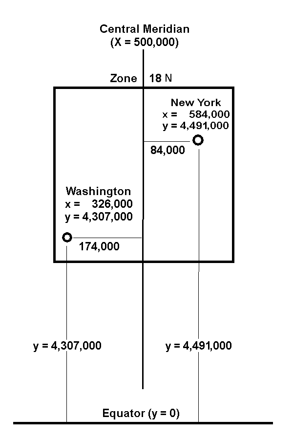
Figure App-3-1: Zone 18, northern hemisphere, showing positions and
coordinates of Washington, D.C., and New York, NY.
An example from the southern hemisphere is given in Figure App-3-2. Note that the equator is assigned a Y value of 10,000,000 meters while the X value of the central meridian of each zone is still 500,000 meters.
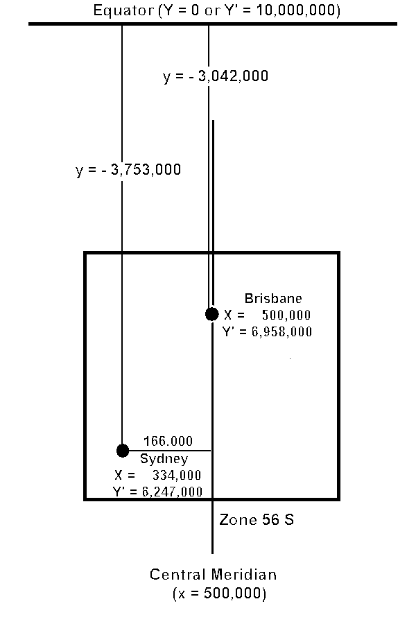
Figure App-3-2: Zone 56 South, showing the locations of Brisbane (latitude 27.5 deg. South,
Longitude 153 deg. East) and Sydney (latitude 33.9 deg. South, Longitude
151.2 deg. East) Australia.
In both figures, as you go northward Y (northern or southern hemisphere) or Y’ (southern hemisphere) increases in value; and as you go eastward, X increases in value. In the southern hemisphere, Y is negative.
Software that converts between UTM and latitude-longitude can be found on the web (see the references). When using such software, use the WGS 84 geodetic system to correct for the fact that the earth is not an exact sphere.
Table App-2-3 lists northings for every 5 degrees of latitude. Each degree of latitude is about 110 – 111 kilometers, or about 68-69 miles. However, because the earth not a perfect sphere, the kilometers/degree (or miles/degree) varies slightly with latitude. Hence, the reference to WGS 84 above.
|
Latitude
(Degrees) |
Northern Hemisphere Northing (y, meters) |
Southern Hemisphere False Northing (y’, meters) |
Southern Hemisphere Northing y (meters) |
Left Edge False Easting (meters) |
Full Width (km) |
|
0
|
0
|
10,000,000
|
0
|
166,021
|
668.0
|
|
5
|
552,644.3
|
9,447,355.7
|
-552,6544.3
|
167,286
|
665.4
|
|
10
|
1,105,412.5
|
8,894,587.5
|
-1,105,412.5
|
171,071
|
657.9
|
|
15
|
1,658,326.0
|
8,341,674.0
|
-1,658,326.0
|
177,349
|
645.3
|
|
20
|
2,211,481.3
|
7,788518.7
|
-2,211,481.3
|
186,074
|
627.9
|
|
25
|
2,764,947.7
|
7,235,052.3
|
-2,764,947.7
|
197,181
|
605.6
|
|
30
|
3,318,785.4
|
6,681,214.6
|
-3,318,785.4
|
210,590
|
578.8
|
|
35
|
3,873,043.1
|
6,126,956.9
|
-3,873,043.1
|
226,202
|
547.6
|
|
40
|
4,427,757.2
|
5,572,242.8
|
-4,427,757.2
|
243,900
|
512.2
|
|
45
|
4,982,950.4
|
5,017,049.6
|
-4,982,950.4
|
263,554
|
472.9
|
|
50
|
5,538,630.7
|
4,461,369.3
|
-5,538,630.7
|
285,016
|
430.3
|
|
55
|
6,094,791.4
|
3,905,208.5
|
-6,094,791.4
|
308,124
|
383.6
|
|
60
|
6,651,411.2
|
3,348,588.8
|
-6,651,411.2
|
165,410
|
669.2
|
|
65
|
7,208,454.6
|
2,791,545.4
|
-7,208,454.6
|
||
|
70
|
7,765,873.1
|
2,234,126.9
|
-7,765,873.1
|
||
|
75
|
8,323,606.8
|
1,676,393.2
|
-8,323,606.8
|
||
|
80
|
8,881,585.8
|
1,118,414.2
|
-8,881,585.8
|
Table App-3-2: Latitudes and their Equivalent Northings
Below is a map showing the zones for the UTM coordinate system. The longitudinal zones are the same both for the original UTM coordinate system and for the GeoCover variation. The latitudinal zones differ, however.
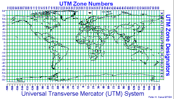
Figure App-3-3: The Original UTM Zone System.
APPENDIX 4: Bibliography
Remote Sensing Textbooks:
Remote Sensing of the Environment, An Earth Resource Perspective, by John R. Jensen, Prentice Hall, Upper Saddle River, NJ, 07458, 2000, ISBN 0-13-489733-1, 544 pages
Remote Sensing and Image Interpretation, by Thomas M. Lillesand and Ralph W. Kiefer, 4th edition, John Wiley and Sons, Inc., New York, NY, 1999, ISBN 0-471-25515-7, 724 pages
Other useful texts:
The Landsat Tutorial Workbook, Basics of Satellite Remote Sensing, Nicholas M. Short et al, NASA Reference Publication 1078, Superintendent of Documents, U.S. Government Printing Office, Washington, DC, 1982, 553 pages (dated but useful).
Geomorphology from Space, A Global Overview of Regional Landforms, edited by Nicholas M. Short, ST. and Robert W. Blair, Jr., NASA SP-486, available on CD-ROM via the Goddard DAAC Help desk at (301)-614-5224 or daacuso@daac.gsfc.nasa.gov. Web version available at:
http://daac.gsfc.nasa.gov/DAAC_DOCS/daac_ed.html
Map Projections – A Working Manual, by John P. Snyder, U.S.Geological Survey Professional Paper 1395, U.S.Government Printing Office, Washington, DC 1987.

 Translate