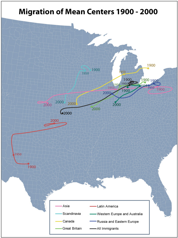
This map shows a clear shift in immigrant presence from East to West, as well as (slightly less so) from North to South. All immigrant groups follow this trend except the Latin American immigrants, which seems logical. Interestingly, most of the shift usually occurs after 1950. The two groups not mapped here are South Asians and Africans, as they did not have consistent enough data to map.
The line representing ‘All Immigrants’ is showing, not only a general shift of all immigrants from Northeast to Southweast, but also a change in the dominance of immigrant groups: if Latin American immigrants in the US are growing in number, and European immigrants in the US are shrinking in number, this would shift the general immigrant center down, even if neither group was on its own shifting location.