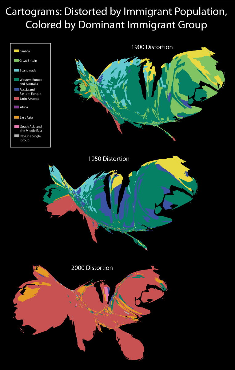
These cartograms are distorted by immigrant number, and show the shift in dominant immigrant group over time. An immigrant group is considered “dominant” if it holds the highest proportion of immigrants in the county. Counties with two groups holding an equal proportion of immigrants are shaded gray. Obviously, 1950 is much more similar to 1900 than to 2000, though a slow shift of both immigrant location and dominance is clearly underway. Each immigrant region is dominant in each year for at least one county with two exceptions: Africa is represented only in 1950 and 2000, and South Asia and the Middle East is represented only in 2000.