These three change maps allow us to easily see where the overall increase of cancer deaths has been more prevalent as they visualize the difference in between 1970 and 1994 values.
While also proving that males have a higher rate of contracting cancer in generation, the male section of the All Cancer change map captures our attention, and wonder, to the central south of the United States. The visualization of a high concentration of cancer deaths denotes a region of concern which, if viewed by epidemiologists, could be utilized as recognizing an area where practices and studies are highly needed. Perhaps there is a geographical element causing cancer, or an environmental factor local to that region only. Such application would be useful in HIV or Swine Flu for if health officials can recognize areas of high concern; they can quickly deploy educational forces and necessary resources to the region to help offset the outbreak.

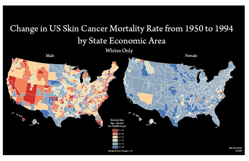
The change map for skin cancer displays that not only do males have a much higher rate of mortality from skin cancer than females, but also it seems that their geographic location has little if anything to do with contraction. Meanwhile, the female section draws up a previously mentioned concern about chloropleth mapping. While here it appears that the skin cancer mortality rate for females seems to be decreasing if not barely increasing across the country, this underscores the fact that women still are contracting the condition. By having to display the two variables, male and female skin cancer mortality, with the same classification and color scheme, the severity of female mortality, though having a lower rate than males, is underscored.
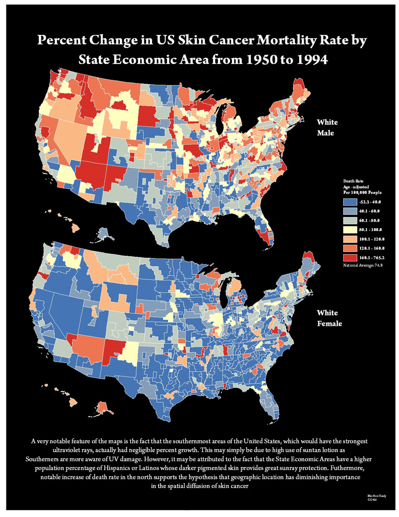
The percent map stands to strengthen the method of identifying regions of concern or sudden outbreak for health officials. In the case of this map, the percent change not only reiterates the northward movement, but also shows that the greatest increase in death from the cancer is happening in the north as well. Furthermore, by seeing that Caribou, Maine, the northern most point of the Lower 48, has the highest percent change, it would serve doctors to take a closer analysis of the region. Again, the simple of ability of a map to identify regions of concerns is a powerful tool that should not be overlooked.
To project the map, I had to calculate the percent change in mortality rate which I found by doing (Mortality Rate 1994 – Mortality Rate 1970)/Mortality Rate 1970 * 100.