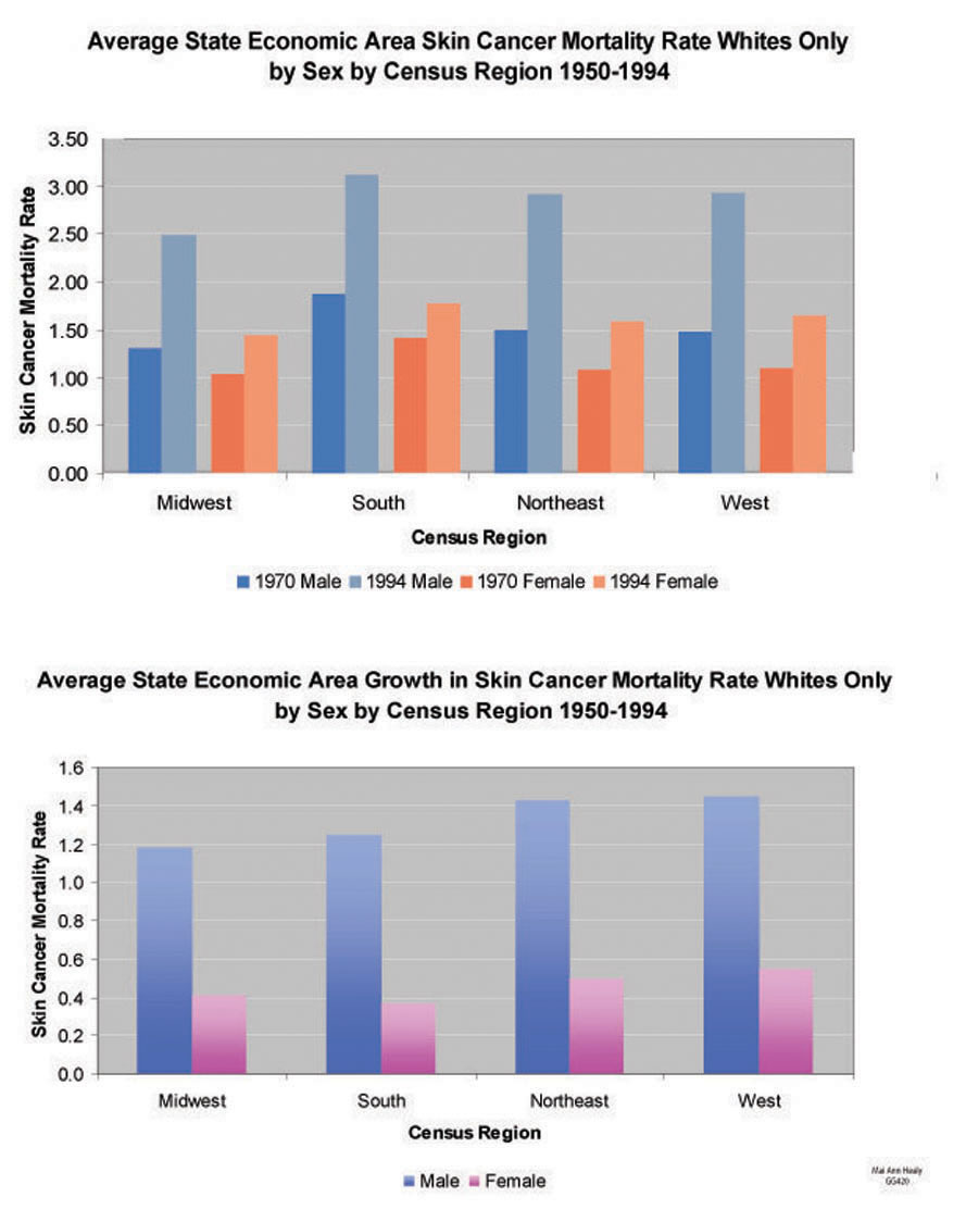
The first graph is a graphical breakdown of average skin cancer rate by state economic area by census region. I found the results by first separating the SEAs into the Census Regions of Midwest, South, Northeast, and West (as defined by the US Census Bureau) and then calculating the average of each region for both male and female for the years 1950-1994. The second graph is a simplification of the first as it shows the increase between the average 1970 SEA value and the 1990.