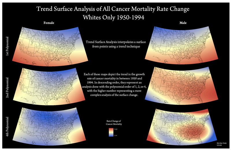
Trend surface analysis interpolates a surface from points using a trend technique that constructs an “elevation” based on the weight of values. Increasing the polynomial order of the analysis results in a more complex breakdown as GIS identifies more and more “elevation peaks” of high cancer rates across the United States.
The trend surface analysis of skin cancer for both male and female once again proved a greater severity of mortality for males than females. But rather than just resting at this conclusion, the analysis also visualized a diverging difference in the geographical direction that the cancer has spread across genders. While the 1st polynomial reveals a general northward trend for both genders, the 2nd shows that males are moving much more towards the east while female mortalities have a noticeable presence in the northwest. The 4th polynomial, however, reveals that female skin cancer barely has a region of high concern while for males there are four peaks. The contrast between the male and female in the 4th polynomial is astounding and causes further concern for the greater probability of males contracting and dying skin cancer before a female.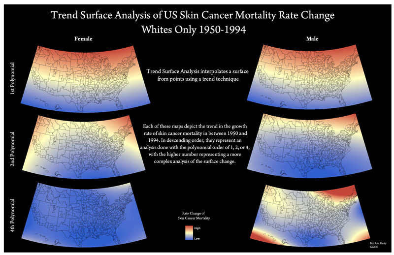
This map would greatly interest medical geographers as it shows the lack of a strong correlation between cancer for males and females. Unfortunately, such a result suggests that there is little relation between one’s environment and geographic location and the type of cancer he/she may contract. But rather than being a con of this mapping technique, this result is invaluable as it suggests that perhaps genetics is the strongest player in the contraction of cancer than any other attribute.
Nevertheless, the maps still provide us with a plethora of knowledge and data. The 1st polynomial breakdown shows us that female and male mortality rate is highest in opposing regions while the second polynomial displays that males have a much higher rate of contracting cancer in almost any part of the country in general than the female whom seems to be concentrated on the south east coast. The 4th polynomial, while reflecting the relatively low occurrence of female mortality from cancer, draws our attention the high male peak of the Central South region of the United States once more. Again, as with the case of the All Cancer Change Map, this assists epidemiologists in quickly identifying regions of concerns. While there may not be an evident environmental cause for cancer as suggested by these diverging analyses, it deserves an investigation to why males in this region are so prone to cancer mortality.
This technique could also be applied to cancers such as leukemia or lung cancer to either prove/disprove their correlation with the natural environment. Leukemia, for example, while also caused by toxic chemicals, is also set on by exposure to nuclear material. Therefore, if one was to run a complex trend surface analysis with perhaps a 12th polynomial and overlay the map with locations of nuclear reactors or power plants, a correlated result would strengthen the case against the relationship between proximity to nuclear material and health concerns. Likewise, a trend surface analysis could be done for lung cancer to see how much of the rust belt, or the old coal factory region, impacted the local population as mine workers and local residents would surely have been negatively affected by the smoke and caves.