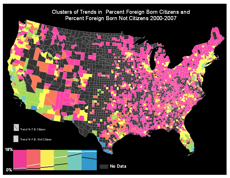
A cluster analysis was done to group counties according to the joint trends of foreign born citizen and foreign born not citizen populations. Pink counties had low percentages of both groups of foreign population and almost negligible growth. Orange counties started with low citizens and not citizens and had a steady increase of non citizens. Yellow counties started low in both variables and had small increases in both. Green counties started with middle value for both variables and had slow increases in both. Bluegreen counties represent counties in which both variables where high, and the foreign born citizen had a steep increase, and Blue counties started with high values for both variables and saw a decline in foreign born with citizenship.
In general, we can see that for most of the eastern United States, percentages of both foreign born citizens and foreign born not citizens are relatively low with the exception of most of Florida which has a few green and blue counties that represent higher percentages of both variables. California has a big concentration of mostly green counties and some bluegreen which represent places that started high and had some increase. The dark blue counties are all located along the Mexican border representing counties that had high percentages of both groups and some decline in foreign born with citizenship.
Analyzing Clusters and Socioeconomic Variables
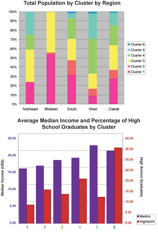
Graph 1 shows that, taking into account only the counties with data, almost 100% of the population in the Midwest, 70% of the South’s population, and 60% of the population in the Northeast was in clusters 1, 2 or 3, which are clusters with low percentages of both types of foreign born. In contrast, almost 70% of the population in the West was in clusters 4, 5 or 6, which had medium to high percentages in both variables. Overall, slightly more than 60% of the population fell in clusters 1, 2 or 3, and slightly less than 40% of the population was in clusters 4, 5 or 6.
Graph 2 shows an interesting pattern between the relationships of both types of foreign born, and average median income. Income increases as the cluster number increases. As we have said before, higher numbered clusters tend to have higher percentages of foreign born populations. This pattern is not as clear for the percentage of high school graduates.