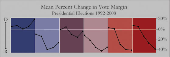
Understanding the Shifts: Population
A variety of demographic variables help explain the pattern of changing allegiances in the second cluster solution.
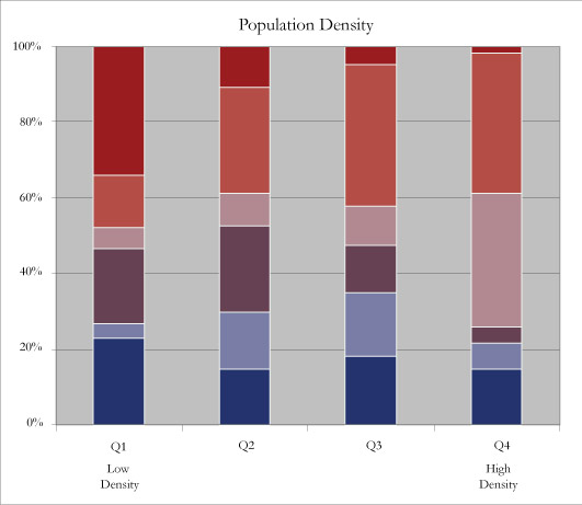
Charting clusters by their distribution across population density quartiles is revealing. It appears that increasingly Republican counties (red) are concentrated in low-density areas, whereas counties with recently increased Democratic support (light purple) are concentrated in high-density areas. However, the chart does not completely reinforce the case for the Republican rural-Democratic urban divide. Consistently republican counties with no change in the 2008 election (light red)are actually concentrated in the two highest density quartiles. Moreover, counties with consistently increasing Democratic support (blue) are distributed across all quartiles, in places of all densities – and are not only concentrated in metropolitan areas, as might be expected. Shift-prone counties are scattered: the light blue cluster is most prominent in the two middle quartiles, whereas the blue-purple cluster is most prominent in the two lowest quartiles.
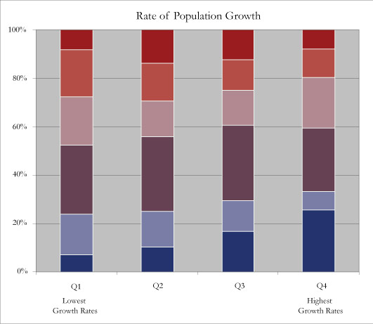
Rate of population growth between 1990 and 2000 does not uncover particularly enlightening causal relationship, seeing as most cluster groups are evenly spread across the growth quartiles. Nonetheless, it is clear that many of the increasingly Democratic counties (blue) are among the fastest-growing in the country.