Urban vs. Suburban:
Cluster Analysis of Change Patterns
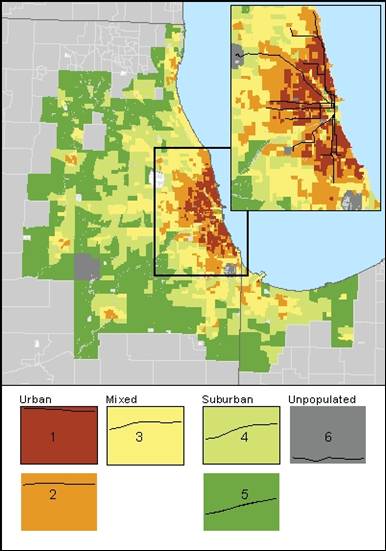
1940-2000 Change in Density
How is the city of Chicago different from the rest of the Chicago metropolitan area?
The Chicago “L,” like many subway systems, was built primarily to serve downtown Chicago and its environs. The arrival and continued growth of the suburbs have occurred thanks in large part to the highway system. Many distant suburbs are connected to the city by commuter trains.
Since the “L” is an urban centerpiece, then, it is necessary to see how the city of Chicago has behaved in comparison to the rest of the metropolitan Chicago area which reaches far out in to the suburbs and even up north towards Wisconsin and out east in to Indiana. This map shows a cluster analysis of trends in density from 1940 to 2000 based on the log (base 2) of the actual densities. A log function is used to make the data fit a more normal curve. Cluster analysis allows us to view shared trends, which in this case helps serve as a tool to differentiate between density trends in the city of Chicago vs. trends for the rest of metropolitan Chicago.
There is a clear demarcation between which census tracts are today considered to be urban and within the city of Chicago (downtown and some immediate suburbs) versus which tracts are more suburban in character. The urban areas make up my area of interest. Today’s urban tracts are those which had the highest densities in 1940, whereas today’s suburbia had much lower densities in 1940 since many were very sparsely inhabited prior to the arrival of the highway system. What I have labeled “mixed” tracts are those which geographically fit between the urban core and the suburban ring. They more or less correspond with highways, but they also pop up in the city itself as well as forming a ring around the city.
The inset map helps highlight how a large share of the “L” lines run through tracts which belong in clusters 1 and 2. Here is a table which summarizes some key statistics for these clusters:
|
Population Density |
|
|
|
|
1940 |
2000 |
Peak Density |
Decade of Peak |
Cluster 1 |
14,183.27 |
9,274.4 |
14,874.572 |
1950 |
Cluster 2 |
3,883.607 |
3,898.51 |
4,541.375 |
1960 |
Most of the tracts that the “L” runs through reached their peak densities many decades ago, which I will discuss later. But in terms of population loss, how dramatic is this change in density?
CLICK to look at population change for the region from 1940 – 2000.