Population Change, 1940-2000
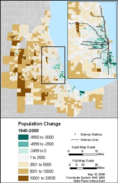
Another way to look at population trends is to look each census tract individually instead of in clusters. This map is looking at the net population change from 1940 – 2000. Tracts which have lost population over these 60 years appear in three shades of blue, whereas tracts which have gained population show up in increasingly darker shades of brown.
Once again, the difference between the suburbs and the city is both obvious and striking. The suburbs have, overall, seen a gain in population over the past 60 years (and in some cases, very significant gains), whereas the city has lost population in a large percentage of its tracts. But where has it lost the most significant amount of population?
The inset map highlights how the “L” is flanked by many tracts which have lost significant amounts of population. This is especially true around some of the southerly routes. In this area, the long term decrease in population is likely due to a decreased number of public housing units. Their demolition certainly would decrease the amount of population in an area, as well as the density. This area is in the midst of a long-term rehabilitation, though, marked by the gentrification of traditionally poor neighborhoods. I would anticipate that in the next few decades many of these areas will start seeing gains in population.
Whereas today many of the “L” stations in this neighborhood are considered to be in “dangerous” territory, there might be a resurgence of ridership as the neighborhoods revitalization continues. One of the most decrepit stations on Garfield Boulevard for the Green Line was recent rehabilitated to modernize it. If this continues up and down the Green and Red Lines, people will be more inclined to ride the “L” if they are originating from those neighborhoods.
Another point of interest is the Blue Line [CLICK to return to the reference map of the “L”]. The two main branches of the Blue Line (one to the northwest, servicing O’Hare, and one to the west, servicing the near suburbs) both run through the median of major expressways. It is not surprising that there is population loss flanking major roadways: the congestion of traffic, noise, and pollution is a major deterrent for many residents.
This map shows the change between 1940 and 2000, but what did the density patterns actually look like in 1940 and 2000? How different or similar were they? Did the “L” service densely populated neighborhoods in the past? Does it service densely populated neighborhoods now?
CLICK to see a comparison of population density in 1940 and population density in 2000.