Decade of Maximum Density
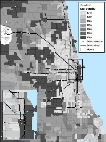
This map shows the decade in which tracts reached their maximum density. The lightest colors are the oldest and the darkest have only recently reached their peak density. This says nothing about long term flip flops between gaining and losing population density, but it does tell you overall which decade could perhaps be called the “glory days” of any given area. Areas that peaked long ago might be called old areas, whereas neighborhoods that recently reached their maximum density might be called newer. This is because increasing density, in urban areas today, is generally a sign that a neighborhood is healthy and thriving: people want to live there.
By and large, most of the “L” lines run through old neighborhoods. It seems problematic that the “L” is running through neighborhoods which reached their peak densities many decades ago. Ideally, then, the “L” would hit neighborhoods that have hit their peak densities in the last 20 years. Although the downtown area is only now reaching its maximum density, that is supposed to only a small slice of the “L”s service area.
CLICK to see the specific example of how the Blue Line misses some of Chicago’s hot neighborhoods.