Population Density,
1940 vs. 2000
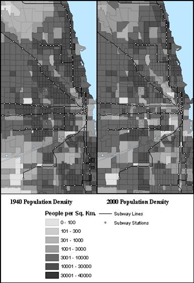
This map gives a static look at population density in 1940 vs. in 2000. Although at first glance the two maps look relatively similar, the “L” lines serve as a very good way to focus on the differences.
Both of these maps use the same gradient which, until the final level of the gradient, follows a very regular pattern. Each level of density is approximately 3 times denser than the one that preceded it. This helps regularize the data. It also shows how significant a change in categories is in terms of actual numbers. Most of the changes in density that I will refer to are from the 6th category to the 5th, which means that if a tract fell from the 6th to the 5th level it experience an average of a 67% decline in density (although the range could be anywhere from minimal change to a 5-fold decrease in density, depending on the original and final densities).
Moving counter clockwise from the northbound Purple and Red Lines [CLICK to go back to the reference map of the “L”], you can see how while many density patterns in the city remain the same today as they were in 1940, the “L” seems to be surrounded by tracts which have experienced decreased density.
The Purple and Red lines show a patchy pattern of very dense tracts today where in 1940 they were more consistently in the second highest category of density. The Blue line to O’Hare shows a similar pattern. The tracts surrounding the Brown Line, which breaks off from the Purple and Red Lines, are within neighborhoods which have experienced decreases in density.
The Green Line and two branches of the Blue Line that seem to make a 3-prong fork straight west have suffered from the most visible decrease in density. What was once a very regularly packed area has now thinned out rather uniformly. As I mentioned before, the center of these three lines runs right along an expressway and so people who have the option to move further away from this nuisance have done so.
The only line that shows very consistent densities around its tracks is the Orange Line, whose primary purpose is to serve Midway Airport to the southwest. These unchanging densities are likely because the Orange Line cuts through many industrial areas which have remained viable. And towards the end of the line, right before the Airport, there are even areas of increased density. This area is largely made of Hispanic residents and has seen a steady increase and presence of bungalow housing.
CLICK to see an animation of changing density patterns from 1940 – 2000.