Change maps are another approach to visualizing change, used to look at the change in percent Hispanic population between particular census years, rather than simply observing the overall growth per year. In this manner, one can discern different time periods and areas of growth or decline—where the percent Hispanic population in one area may be relatively high overall, it may actually decrease in later years, a fact that would be difficult to realize on a map of straightforward growth. The following four maps show these changes in percent Hispanic population between each set of census data, with varying shades of red to show decline and green to display increase.
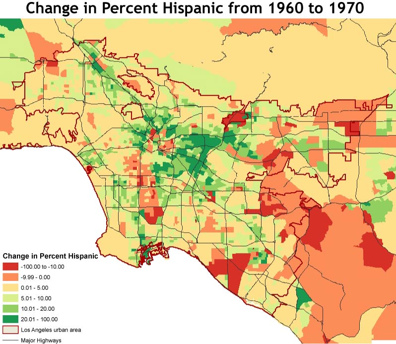
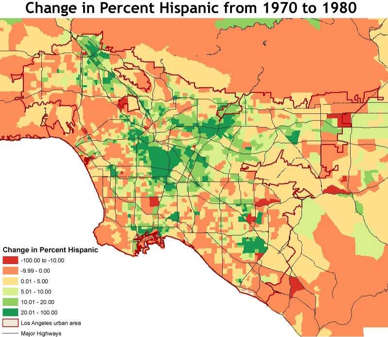
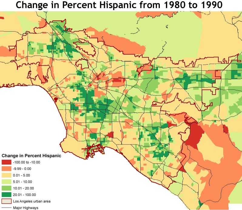
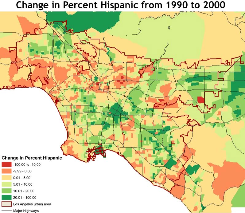
Because my study only covered the years from 1960 to 2000, it is crucial to remember that an extensive Hispanic population has lived in this area for more than a century, and has only increased. Thus, primary immigrant neighborhoods may retain high levels of Hispanic population but may be decreasing in recent years as younger generations grow up and move to other areas or immigrants chose new enclaves in which to settle. With this in mind, it is interesting to note the recent movement and trends in Hispanic population as central communities seem to spread southward toward the harbor area as well as to the north. Boundaries of major highways here serve to show some of the delineations of these communities.