These bivariate maps are similar to those previously displayed, this time showing the percent of the total population that has a college degree as well as the percent Hispanic population in 1960, 1980, and 2000. In these cases, the maps show greater disparity in the variables rather than high correlation—areas with high percent Hispanic have a very low percentage of population with college degrees, while other areas have increased significantly in their attainment of higher-level education and show lower levels of Hispanic population.
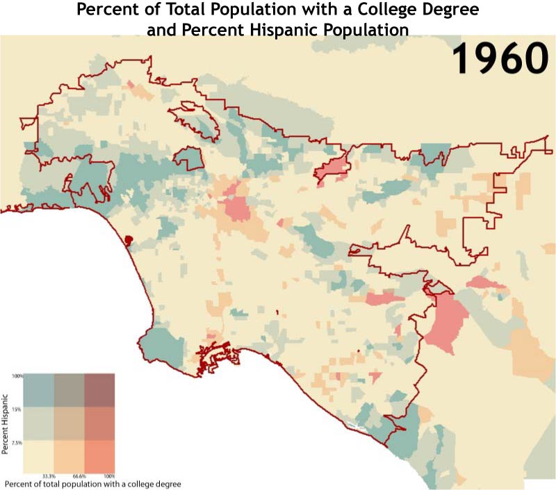
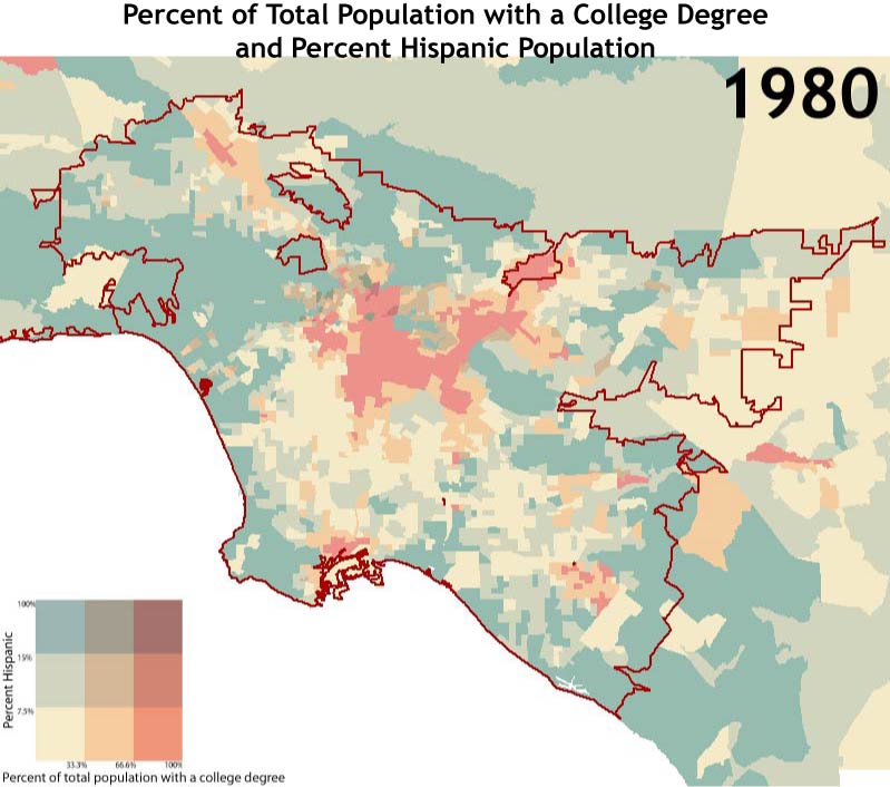
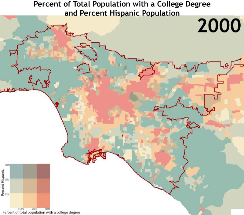
Notice in these maps the spreading out of Hispanic populations in pink and orange in the central area, in contrast to the spatial extent of those populations with college degrees in more affluent regions such as the Westside and other neighborhoods near the edge of the urban area.
As displayed in this array of maps and animations, levels of Hispanic population in the Los Angeles urban area, while already high in the early half of the century, have only increased. Clusters and trends of growth are important to note, as they pertain to particular communities or immigrant groups within the city, some of which struggle with the challenges of language and poor education.